Monday 25 April 2016

Cinematography in Films

12 Angry Men (1957)

When it comes to commercial film-making camera work or rather cinematography is pretty extensive. With various camera set-ups and other technical equipment, people forget the art of minimalist film-making and the classic 50’s courtroom drama 12 Angry Men is the finest example of one.


Sidney Lumet’s debut feature film had amazing camera work. The most brilliant aspect is how the most production and filming takes place just in one room where the jurors beg to differ in their opinions. The film has simple but clever script for a courtroom drama. With not much heavy production it still is one of the best courtroom dramas.
The film is one of the most intense yet slow-boiling drama which is the result of perfect dialogue delivery and heated performance by all 12 actors. A major id to the film was cinematography by Boris Kaufman.
The opening shot is of grand classical courthouse room. The camera swoops through its architecture and follows people through its corridors finally to the jury. It is soon revealed only white-suit clad Juror no. 8 (Henry Fonda) takes a ‘non-guilty’ stance against all other jurors.


What we notice in the film is that lot of the tension in the script is created by the craft of cinematography. The camera work along with lighting is very tactfully used. The script slowly builds up with Juror 8 claiming the boy accused of murder to be innocent later convincing all the jurors in the end including the most stubborn and prejudiced ones. The weather also plays a huge role in the script which gets hotter and hotter as the tension grows and the day passes by.


We see more wide- angle shots in the beginning and later the shots become closer to the jurors’ faces imploding their emotion and the tension of the situation.  Later the lens is completely focused on jurors’ faces filling the whole frame increasing the proximity and brimming tension. The script peels off as each man loses his clothing with boiling heat. When finally all jurors agree as non-guilty the film breaks of with showing us the outside of the courtroom again. 

The cinematography of this film is what makes it so great in spite being as simple as to being majorly shot in one room.  The film is shot in thirds’ to depict various mood and emotions in the situation with the first third being shot above the eye-level, then at the same eye-level and in the end below the eye-level. This aided in showing anger and tension of the film through its course. 

Friday 22 April 2016

Production Design in Films


The Danish Girl (2015)

The Danish Girl is 2015 feature film starring the Academy Award winning actors Eddie Redmayne and Alicia Vikander (latter of which won an Oscar for the eponymous film). The much awaited film is based on the book by David Ebershoff depicting the true story of the many struggles in the life of Lili Elbe, one of the firsts’ to go through with sex reassignment surgery. 
Eddie Redmayne gives a phenomenal performance portraying Lili Elbe or Einar Wegner displaying a complete identity overhaul in the skin of brave life like Lilli. The transition and journey forms the heart and soul of the film. Redmayne, teamed with his Les Miserables director Tom Hooper, the movie shows a very touching and intimate introspection.

Other than the acting and direction the production design adds a beautiful stroke of aesthetic depiction in the film. This beautiful and humane depiction of the screenplay grabbed several Oscar Nominations including ‘Production Design’. The production designer, Eve Stewart who also teamed up with Tom Hooper in Les Miserables and King’s Speech gave poignant bend to the film with beautiful landscapes and melancholic views. Alicia Vikander did a marvelous job on portraying the supporting confidante and wife to Einar, Gerda. She throws light upon the struggles of Gerda on losing her best friend and husband yet standing by his side through it all.

The production design made the film poetic yet believable with elements which were aesthetically beautiful with being true to the era. It captured the characters’ soul as an artist and depicted the movie like a painting. The muted shades of 1920s Copenhagen and the studio where the couple live are seen in the paintings.  Stewart wanted to evoke Lilli spiritual journey on screen as depicted in the book.
Eve Stewart visited the Copenhagen block where Lilli and Gerda lived and that’s how she came up with beautiful studio design where most of the film takes place. The studio is most dark corners with one major light source lighting up the whole room in an artistic sense. The studio scattered with paintings and sketches along with blobs and marks of colours looked realistic.

The scenes and set depict the femininity of Lilli with the fabrics, muted pink colours, perfumes, cosmetics especially seen in the departmental store where Einar discovers he is entitled to be a woman. This brings contrast to the dark caged and lonely mood of the paintings Einar painted depicting his life. Later when Gerda takes over there is an explosion of colour in the set and costumes with Lilli coming into full bloom.
The set helped depict the emotions and turmoils of Lilli in every way. The colours look like the strokes on a painting, all in a beautiful canvas like screen.

The makeup and costumes are all beautiful yet historically accurate. The costumes along with the set aids to tell us the mood of the story and the inner struggles of Einar on becoming Lilli. 

Thursday 21 April 2016

Fashion Short Films and Critique

Fashion Short Films

Short films are mostly independent films or art house films which are mainly not for the masses. The beauty of a short film is when it’s shorter and yet the narration is crisp and relatable. Wes Anderson’s Prada film ‘Castello Cavalcanti ‘leaves you wanting for more.


It is shot in classic Anderson style with bright colors having a humorous tone to the film. It captures the 50’s classic Italian charm and sends the message of treasuring leisure the Italian way. The film’s mood seemed like an ode to Fellini’s La Dolce Vita. The short film presents like an art with beautiful long shots and pan shots. The element which gripped me is the phone conversation shot and how the lighting changed with the mood.
The strongest element was how visually appealing was the film and made me wanting to go to the particular Italian village.


The next short film, ‘The Others Me’ has a very grippingly intense theme to it. It opens with pan shots and low shots and uses various lighting and effects. The film has a mysterious theme to it and the chic model portrays a certain femme fatale look about her. The neon lighting along with the dissolve and twin shots seem to be very interesting. The makeup and the risqué clothing give the film a promiscuous theme to it. The power statement is also very strong. Especially the last shot from above seems to be very intense. The musical score builds up the tension for the viewers.


Rachel Antonoff’s cute fashion film for her spring collection features her drummer brother Jack Antonoff and has nice muted colors and pastel theme creating a summer feel to it. Through her fashion film which is a family affair she tells the story of the senior Antonoff’s. The narration and upbeat music keeps it interesting. ‘Crush’ appeals to the youth and has sharp editing techniques.


 Walking Stories captures Italian beauty and charm to its best with pan shots of Florence and a vintage score to it. The production design and extreme long shots combined by pan shots really give the rom com an aesthetic appeal. The beautiful storyline really pleases the eye and heart. The film captures the soul of Salvatore Ferragamo profoundly.


All in all fashion films provide a certain aesthetic among short films and the storyline plays a huge importance along with the visual theme. Sound, editing and camera techniques make the films more appealing to their themes.

Film Editing Techniques


Deadpool (2016)


Ryan Reynolds starring newest edition of the Marvel’s X-Men universe, Deadpool boomed the box office last week stunning the viewers with incredible sound and cinematic editing along with powerful visual effects. It didn’t fail to impress the superhero sublime in the classic blockbuster portrayal.
 So what does make the anti-hero movie so likable? Other than of course the sarcastic wit of the character that captures the mass attention, the editing of the film helped it stand out amongst typical super hero blockbusters.

The role of movie editing plays a ginormous role especially in superhero flicks or in this case ‘antihero’. The stunts and visual effects are needed to stun the audiences all over. Same for ‘Deadpool’, Julian Clarke did master editing to visually aid the blockbuster hit especially with the flashback and rewind techniques fine-tuning the footage.

The editing in Deadpool was more than important because of the gratuitous and vulgar scenes, making it ‘watchable’ for the mass. Julian Clarke used Adobe Premiere Pro and After Effects to edit Deadpool. The paradox of editing this particular film was taking the decision of what to flush out and what to keep for the audience ease of viewing.


The movie didn’t work with a linear narrative and was more fragmented than whole so it matched the cynical, witty tone of the movie. The editing captured the various moods and emotions of the film, especially the dramatic torture scenes and the doomed cancer scene.


The movie mostly had comical themes with visually tensed fight scenes. There were various break shots, rewind and slow-motion shots to tell Wade Wilson’s tragic story into Deadpool which had an underlying sadness to it. The camera shots mainly used were wide angle and long shots capturing the destruction scenes. The emotional scenes with Wade Wilson were shot by close up shots. The color scheme of the movie was mainly muted so as Deadpool’s bright red costume stands out.


The pace of the movie is pretty fast with the soundtrack being upbeat such as ‘Salt-n-Pepa’ and ‘Wham!’ which is adding to the goofiness of the movie theme. The movie used a lot of Fade and Dissolve shots and especially Low Angle and Mid shots for the fight scenes.

The layering and the effects such as the building destruction, the fire fight scene, the mutant energy scenes were created on Adobe After Effects. There were pretty advanced techniques used catering handheld camera shakes and rendering on After Effects.


There editing techniques used such as cutting frames for collisions and fight scenes to create the exaggerated effects and to amp the speed up along with the pace of the film, Digital snap zoom was used to draw the audience attention and especially 22FPS shots were filmed.
All in all Deadpool gave a visually appealing experience with master editing techniques and skills.

Wednesday 20 April 2016

Film Editing Techniques

Film Editing Techniques

Gone Girl (2014)
When Gone Girl released in the year 2014, everyone anticipated a gripping thriller movie with adapted screenplay from the eponymous book by Gillian Flynn and being the even more reason for the anticipation, directed by David Fincher. And the movie proved to stun us by grabbing all viewers’ attention and being a box office blockbuster. The movie had ensemble actors such as Ben Affleck, Rosamund Pike, Neil Patrick Harris, Tyler Perry and many others who gave bone chilling performances exceptionally Rosamund Pike who was so amazing in her delivery and proved to be believable yet so scary.

The movie has a smooth pace transitioning and twisting into sub-plots. But the editing and screenplay was master craft. Of course being a Fincher piece it focused on various details yet unraveled the story in such a manner that the sublime theme gave us chills. It was the latest mysterious edition of a David Fincher but it had its share of firsts too, topically speaking it was the first Hollywood studio feature to be edited on Adobe Premiere Pro CC which is a pretty proud moment for Adobe Franchise. 


The movie has acute directional aspects and of course groundbreaking editorial. The credit of which goes to editor Kirk Baxter ACE along with his workflow with Fincher. He is a part of the ‘Fincher Team’ and has worked with him now in 3 movies. The masterminds behind the editorial were not just Baxter and Fincher but also assistant editor-Tyler Nelson, post production supervisor-Peter Mavromates and post-production engineer Jeff Brue.


There were a lot of transition shots in the film such as wide to close shots. Fincher especially shot lot of wide angle shots which used to help in stabilize and recreate or perfect the particular shots. A major task in the post production process was to edit a hoard of 500 hours raw footage which while compressing and being aware of the time yet letting the content naturally flow.
Something very unnerving about the cinematography is how the editor split the scenes which featured more than one actor to focus attention on the particular subject. There just purposeful shots without anything unnecessary which doesn’t add to the storyline which made the film pretty direct.


The town is introduced in extreme long shots with a monotonous score reflecting the recessive mood of the marriage. The score especially temps up and down along with the pace of the plot gripping and building your tension.
Intensity with the characters and their vulnerability were mainly focused on the shots with the frames being pretty minimalist. Hence many elements that disturbs the eye such as an extra or a reflection or movement was cut out.

One particular handheld shot is interesting which is where Affleck’s character Nick ducks away from the hounding press and the handheld camera movement added to the gravity of his character being assaulted in the chaos. The film’s theme deals a lot with our internal self and what we speak to the world and how when that rips of brims the insanity in oneself. The characters are very smart as they seem to be pretty likeable to the viewer even when they morally aren’t. There are dissolve and slow-motion sequences of brutal and violent shots making it more intense. We even see sharp camera shots in crux of tension which brims in the plot especially when the detectives blame Nick for betrayal.


The editing is cleverly done with the juxtaposition of different elements yet breaking them down from their complexity. There is a lot of voiceover used with different tones along with various flash backs and ping pong of plots.

Thursday 12 November 2015

Ancient Roman Clothing

ROMAN CLOTHING


Roman clothing are often confused with the Greek clothing, even though they had similarities they can be distinguished easily.

Clothing in Ancient Rome was not a liability but a luxury for the civilians and especially clothing with linen and silk was not very affordable to be spun at home. The costumes of the civilians can be distinguished in two ways, which were slipped over the head and which were wound around the body. dying was a very common act among Romans.


TOGA was a wrapped garment which was also known as the Roman cloak. Toga was only worn by men and was an official garment for all public events. Toga also required a huge amount of spun cloth to be draped around the body. Earlier an outer garment for both the sexes which also served as a night blanket, it later became popular among men and worn on all occasions. The Toga came in different borders and embroideries according to ranks and classes.


Sometimes the Romans also wore various tunics under their Toga. For footwear the Romans wore sandals which had simultaneous strips of leather surrounding the feet and calves too.  Animal skins and various leather were used often for war garments.


The drapery became very complex and elaborate at the same time. Women wore a PALLA which was an equivalent to the male TOGA. This lengthwise fabric was held on the shoulders by FIBULA (Brooch). There was a variety of fabrics that were worn like wool and silk.


Here are few of my illustrations reflecting on Roman clothing.


Picture credits: Pinterest
References: http://www.historyonthenet.com/romans/clothing.html
http://www.crystalinks.com/romeclothing.html

Ancient Greek Clothing

GRECIAN CLOTHING


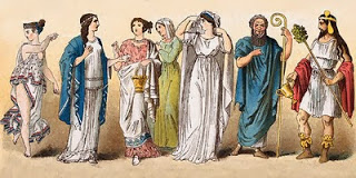
Clothing from the Ancient Greece can be seen as an inspiration quite often these days. Reflecting back in the times the clothing developed quite a lot since past ages. Greek clothing was mostly homemade draping rectangular linen and wool with little or no stitching involved in the dress-making process.


Men and women clothing was not necessarily differentiated and even often interchangeable. The garments were still draped but in new different styles and even sometimes stitched. The traditional permanence always remained in the Greek and Roman costumes. The garments were Chiton, Chlamys, Peplos and Himation.


Greek god Apollo

CHITON was the most common garment worn by both the sexes. This was a rectangular piece of cloth woven in various sizes. The men earlier worn a tunic belted at the waist called the EXOMIS.


Chiton was a smaller form of Exomis which could be pinned, belted or stitched. This could also serve as a night garment if it was not belted. HIMATION was a cloak like garment without any fixed fastenings. PEPLOS was mainly worn by the women which was a shawl attached with fibulae and could be open or close depending on modesty. Women even wore a bra like undergarment called Strophion around their breasts.


Greek clothing didn't necessarily have bright colors and was mainly in hues of white as they came. The Greeks were very utilitarian in nature and weren't had much extensive clothing expressions like the Egyptians.
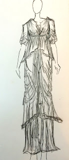
Here are few illustrations of mine reflecting on ancient Greek clothing.


Picture Credits : Pinterest.com

References : http://www.ancientgreece.com/s/Clothing/
http://www.ancient.eu/article/20/